Design Responsive User Profile Card Template using HTML, CSS, and JS
This blog post teaches how to make profile cards on a website using HTML, CSS and JavaScript. Profile cards are like digital business cards that show information about someone or something. They usually have a picture, a name, and other details like job title or location.
The post gives easy steps and example codes for making different kinds of profile cards, even if you’re new to using HTML and CSS. It helps you learn how to create professional-looking profile cards that people will like.
Let’s start learning about designing profile cards
1. Responsive Profile Card UI using HTML and CSS
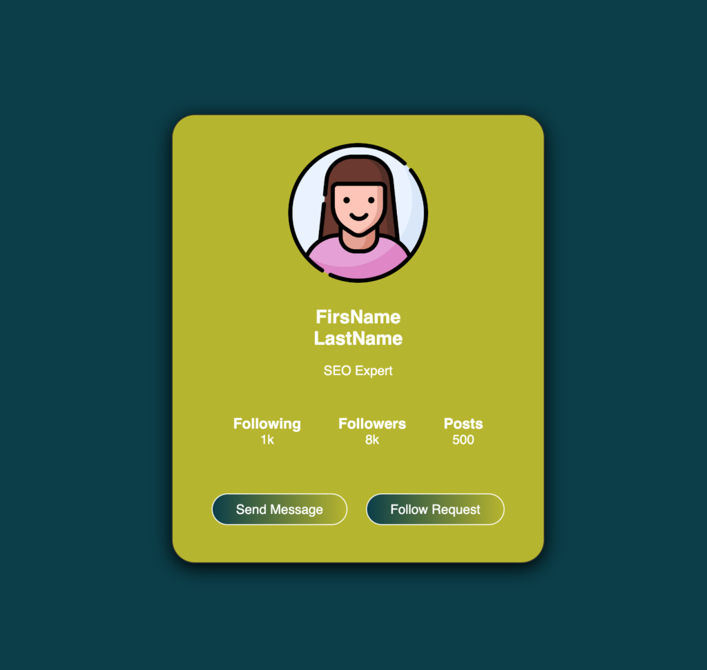
Are you looking for a straightforward way to showcase yourself or your portfolio online? Then this responsive and beautiful user profile card is designed for you. It includes all the necessary information: your picture, your name, your job title, and links to your social media. It’s simple, but it gets the job done. Plus, I’ve made sure it looks good and is super easy to grasp.
This profile card is perfect for anyone who wants a clean and professional online presence without a lot of fuss. Even if you’re not a coding person, you can easily put this together using basic HTML and CSS. Don’t worry if coding isn’t your thing – I’ve provided all the resources you need to make it happen, including the source code.
So, whether you’re a freelancer, a small business owner, or just someone who wants to start to learn coding. This profile card design has got you covered. It’s a simple yet effective way to make a lasting impression on the web. Give it a try and see how it can elevate your online presence!
2. Beautiful Responsive Profile Card Design Using HTML & CSS Only
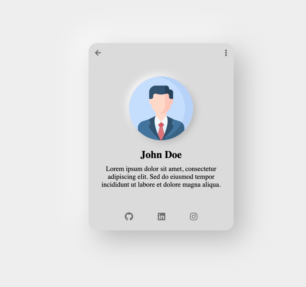
Check out this cool profile card design made only with HTML and CSS! It’s super easy to create and looks really, modern. The design is called neomorphic, which means it has a sleek and stylish look that catches your eye. This card has everything you need, like your picture, your name, and buttons to link to your social media. It’s perfect for showing off your profile in a way that stands out from the crowd.
If you want to make this your own, neomorphic profile card, just click on the button below called “Download Source Code”. Unzip the downloaded source code file, and open it in your Visual Studio Code and open the index.html file in your desired web browser. You can make it your own by customizing all the information, such as color, font size, and icon size, etc. To do this you don’t need any software or complicated coding skills – just HTML and CSS. With a little bit of time and effort, you can have a profile card that looks as good as the one in the example. So why not give it a try and impress your friends with your awesome new profile design?
3. Responsive Card with Dark and Light mode Features using HTML, CSS, and JS
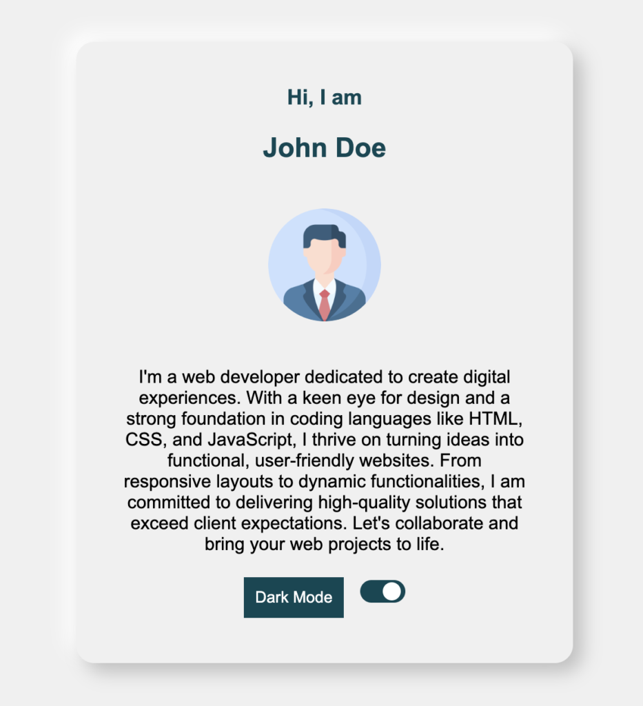
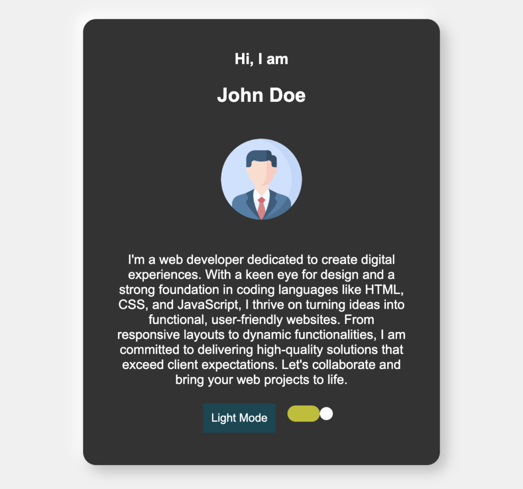
In the world of web development, mastering HTML, CSS, and JavaScript is must. One of the best practices to gain these skills is by designing and creating responsive card design with dark and light mode features. This will equip you with versatile tools to create visually appealing and user-friendly interfaces.
Look at the following clips to see, how it looks like if we use light and dark mode feature in our card.
So, why is this kind of project Is essential for developers aspiring to refine their skills?
Firstly, responsive design has become a cornerstone of modern web development. With the large numbers of various devices and screen sizes, ensuring that your web content adapts seamlessly to different environments is important. By mastering responsive card design, you gain a deeper understanding of CSS media queries, flexbox, and grid layout systems, empowering you to create fluid and engaging user experiences across devices.
Adding dark and light modes to your website makes it look nicer and work better. People like having options, so letting them choose between light and dark themes makes them happier and makes your website or your portfolio easier to use. Making, this happen you need to be good at CSS for how things look and JavaScript for making things happen on the page. This helps you get better at both CSS and JavaScript.
To access the source code for this dark and light mode user profile card, simply click the button below to download and unzip the file. Then, open the extracted folder on your computer and launch the HTML file in your preferred web browser. From there, you can customize the text, colors, size, and elements to suit your needs.
4. Create Responsive Cards to display User’s Information Dynamically using HTML, CSS, and JS

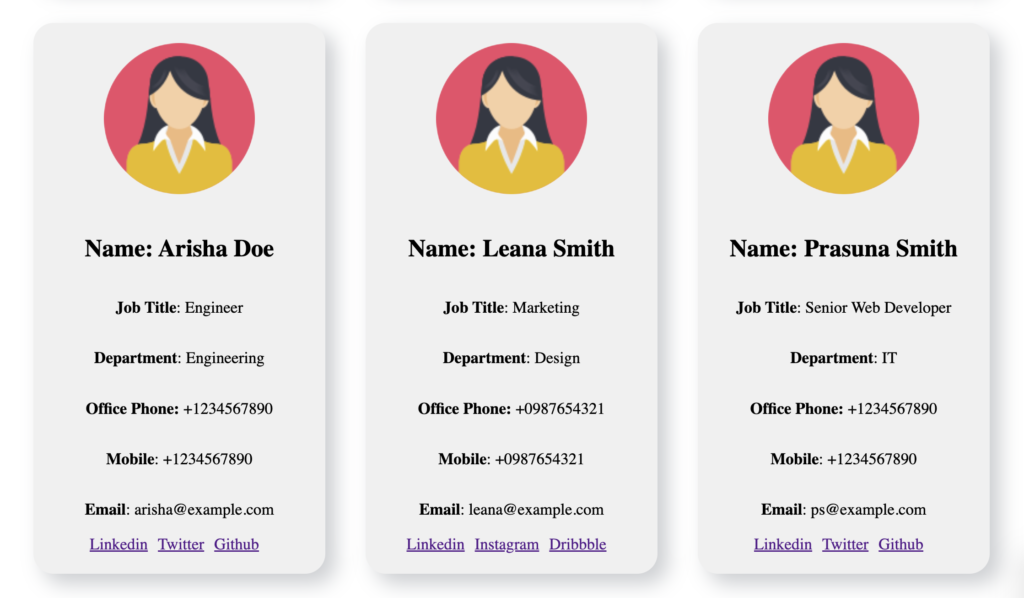
Making websites and learning how to change the Document Object Model (DOM) is like having a powerful tool. One way to do this is by showing things on the screen in a dynamic way. This article talks about a project that does just that and explains why it’s great.
This Project uses DOM (Document Object Model) Method to Create Cards
This project shows how to use the DOM in a smart way. Instead of writing everything in the HTML file, it uses JavaScript to create user profiles as needed. Imagine building a puzzle: each piece (like a profile card) fits together perfectly. There is a function in script.js file. It called generateProfileCard(). This function takes all the user information that is found in profile.js file and creates a beautiful card and displays it in the webpage. You can add user information in the profile.js file as much as possible and the web page will show all the user’s information dynamically. It puts all the details, like names and social media links, into the webpage without needing to write them directly in the HTML page.
Smart Way to Show Any Information
This project isn’t just about technical skills. It’s also clever how it shows the user’s information. This project is flexible and can handle lots of profiles without breaking.
We are using JavaScript objects and arrays. These organize user data neatly. If you want to add a new profile or change something in the existing data, you can go directly to the profile.js file and can add or change.
And this project looks good on any device. Whether you’re on a big computer screen or a tiny phone, the profiles adjust themselves. It fits perfectly in every screen size.
This project shows off some serious web development skills. By playing with the DOM and being smart about design, it proves that creativity and elegance go hand in hand. So next time you see a profile card pop up, remember: Web development is full of exciting possibilities!
If you want to make this project your own, please click on the button below “Download Source Code”, and unzip the file and open it in any web browser. You can try to add more users in the profile.js file and see how dynamic it is.

