Awesome Slideshows
Beautiful slideshows on websites are super cool and make things really interesting. They’re way better. When you show cool pictures, slideshows people get more interested and remember stuff better.
People like web designers, web developers, artists, and others who make things online sometimes find it hard to explain their ideas. But if they use picture slideshows or if they make beautiful slideshows, they can show how good they are at their work.
Businesses that sell stuff online can use slideshows to show off what they’re selling. When people see lots of pictures of a product, they feel more sure about buying it.
Remember, when you visit a website, the stuff you see stays in your head. That’s why using really good slideshows is important. There are lots of awesome slideshows that work well and look great. They make the website fun and make people remember what they saw.
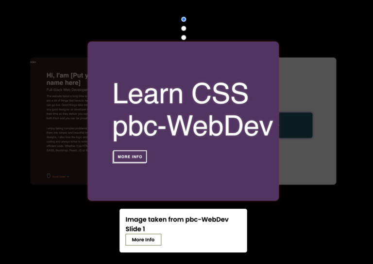
In this article, I’ll be introducing a completely responsive slideshow created only using advanced HTML and CSS. But before diving into its details, take a moment to watch this video showcasing the slideshow in action.
To create a showcased in the above video clips, follow these step-by-step instructions:
Step 1: Organize a folder structure by creating a new folder on your computer. Name it appropriately, then within this folder, create two files:
- ‘
index.html'for HTML code. - ‘
style.css'for CSS code.
Step 2: Copy the provided HTML code and paste it into your ‘slide.html‘ file.
<!DOCTYPE html>
<html lang="en">
<head>
    <meta charset="UTF-8">
    <meta name="viewport" content="width=device-width, initial-scale=1.0">
    <link rel="stylesheet" href="slide.css">
    <title>Slide</title>
</head>
<body>
  <div class="beautiful">
    <div class="beautiful__slides">
      <div class="beautiful__slide">
        <div class="beautiful__slideBg"></div>
        <div class="beautiful__slideContent">
          <span>Learn HTML</span>
          <span>pbc-WebDev</span>
          <a class="button" href="https://pbc-webdev.com" target="">More Info</a>
        </div>
      </div>
      <div class="beautiful__slide">
        <div class="beautiful__slideBg"></div>
        <div class="beautiful__slideContent">

          <span>Learn CSS</span>
          <span>pbc-WebDev</span>
          <a class="button" href="https://pbc-webdev.com" target="/black">More Info</a>
        </div>
      </div>
      <div class="beautiful__slide">
        <div class="beautiful__slideBg"></div>
        <div class="beautiful__slideContent">
          <span>Learn JavaScript</span>
          <span>pbc-WebDev</span>
          <a class="button" href="https://pbc-webdev.com" target="">More Info</a>
        </div>
      </div>
      <div class="beautiful__slide">
        <div class="beautiful__slideBg"></div>
        <div class="beautiful__slideContent">
          <span>Learn React</span>
          <span>pbc-WebDev</span>
          <a class="button" href="" target="/black">More Info</a>
        </div>
      </div>
    </div>
    <div class="beautiful__shutters"></div>
  </div>
</body>
</html>
Below is the details explanation of the HTML code used in the above file:
The provided HTML code represents a structured set of elements using various classes to define styles and organize content. Let’s break it down:
- The outermost element is a `<div>` with the class “beautiful“. This acts as a container for the content within it.
<div class="beautiful">

</div>- Inside the “beautiful” div, there is another `<div>` with the class “beautiful__slides“. This is a wrapper for a slideshow.
<div class="beautiful">
     <div class="beautiful__slides">
    </div>
</div>- Within “beautiful__slides“, there are multiple `<div>` elements, each having the class “beautiful__slide“. These represent individual slides in the slideshow.
<div class="beautiful">
    <div class="beautiful__slides">
      <div class="beautiful__slide">
      </div>
      <div class="beautiful__slide">
      </div>
      <div class="beautiful__slide">
      </div>
      <div class="beautiful__slide">
      </div>
    </div>
</div>- Each “beautiful__slide” contains two child `<div>` elements. One is “beautiful__slideBg“, It is used for background styling (color) or image placement, and the other is “beautiful__slideContent“, which has the content of the slide.
<div class="beautiful">
    <div class="beautiful__slides">
      <div class="beautiful__slide">
        <div class="beautiful__slideBg"></div>
        <div class="beautiful__slideContent">
        </div>
      </div>
      <div class="beautiful__slide">
        <div class="beautiful__slideBg"></div>
        <div class="beautiful__slideContent">
        </div>
      </div>
      <div class="beautiful__slide">
        <div class="beautiful__slideBg"></div>
        <div class="beautiful__slideContent">
        </div>
      </div>
      <div class="beautiful__slide">
        <div class="beautiful__slideBg"></div>
        <div class="beautiful__slideContent">
        </div>
      </div>
    </div>
</div>- Inside “beautiful__slideContent“, there are `<span>` elements containing text of the slide. Additionally, there are `<a>` anchor elements styled as buttons with the class “button“. These links navigate to different web pages when clicked.
<div class="beautiful">
    <div class="beautiful__slides">
      <div class="beautiful__slide">
        <div class="beautiful__slideBg"></div>
        <div class="beautiful__slideContent">
          <span>Learn HTML</span>
         <span>pbc-WebDev</span>
         <a class="button" href="#">More Info</a>
        </div>
      </div>
      <div class="beautiful__slide">
        <div class="beautiful__slideBg"></div>
        <div class="beautiful__slideContent">
          <span>Learn CSS</span>
         <span>pbc-WebDev</span>
         <a class="button" href="#">More Info</a>
        </div>
      </div>
      <div class="beautiful__slide">
        <div class="beautiful__slideBg"></div>
        <div class="beautiful__slideContent">
          <span>Learn JavaScript</span>
         <span>pbc-WebDev</span>
         <a class="button" href="">More Info</a>
        </div>
      </div>
      <div class="beautiful__slide">
        <div class="beautiful__slideBg"></div>
        <div class="beautiful__slideContent">
          <span>Learn React</span>
         <span>pbc-WebDev</span>
         <a class="button" href="#">More Info</a>
        </div>
      </div>
    </div>
</div>
Step 3: Enhance the visual appeal of your slideshow by copying the following CSS codes into your “slide.css” file. You can change some elements such as colors, fonts, backgrounds, and even image to create a more unique and appealing slideshow. These changes will help you in making each slide unique and visually engaging.
html, body {
  width: 100vw;
  height: 100vh;
  overflow: hidden;
}
.beautiful {
  position: absolute;
  height: 100%;
  width: 100%;
  animation: rotateHue infinite 20s linear;
  animation-delay: 0.625s;
}
@keyframes rotateHue {
  0% {
    filter: hue-rotate(0deg);
 }
  20% {
    filter: hue-rotate(0deg);
 }
  25% {
    filter: hue-rotate(90deg);
 }
  45% {
    filter: hue-rotate(90deg);
 }
  50% {
    filter: hue-rotate(180deg);
 }
  70% {
    filter: hue-rotate(180deg);
 }
  75% {
    filter: hue-rotate(270deg);
 }
  95% {
    filter: hue-rotate(270deg);
 }
  100% {
    filter: hue-rotate(360deg);
 }
}
.beautiful__shutters {
  position: absolute;
  height: 150vmax;
  width: 150vmax;
  left: calc(50% - 75vmax);
  top: calc(50% - 75vmax);
  pointer-events: none;
  z-index: 2;
  animation: rotateFrame 10s linear infinite;
}
@keyframes rotateFrame {
  0% {
    transform: rotate(0deg);
 }
  100% {
    transform: rotate(180deg);
 }
}
.beautiful__shutters:before, .beautiful__shutters:after {
  content: '';
  position: absolute;
  height: 100%;
  width: 100%;
  left: 50%;
  transform: translate3d(-50%, 0, 0);
  background-color: #bebd00;
  pointer-events: auto;
}
.beautiful__shutters:before {
  bottom: 50%;
  animation: openTop 5s infinite;
}
@keyframes openTop {
  0% {
    transform: translate3d(-50%, 0, 0);
    animation-timing-function: cubic-bezier(0.8, 0, 0.1, 1);
 }
  40% {
    transform: translate3d(-50%, -65vmax, 0);
    animation-timing-functon: cubic-bezier(0.6, 0.04, 0.98, 0.335);
 }
  70% {
    transform: translate3d(-50%, -65vmax, 0);
    animation-timing-functon: cubic-bezier(0.6, 0.04, 0.98, 0.335);
 }
  100% {
    transform: translate3d(-50%, 0, 0);
    animation-timing-function: cubic-bezier(0.6, 0.04, 0.98, 0.335);
 }
}
.beautiful__shutters:after {
  top: 50%;
  animation: openBottom 5s infinite;
}
@keyframes openBottom {
  0% {
    transform: translate3d(-50%, 0, 0);
    animation-timing-function: cubic-bezier(0.8, 0, 0.1, 1);
 }
  40% {
    transform: translate3d(-50%, 65vmax, 0);
    animation-timing-functon: cubic-bezier(0.6, 0.04, 0.98, 0.335);
 }
  70% {
    transform: translate3d(-50%, 65vmax, 0);
    animation-timing-functon: cubic-bezier(0.6, 0.04, 0.98, 0.335);
 }
  100% {
    transform: translate3d(-50%, 0, 0);
    animation-timing-function: cubic-bezier(0.6, 0.04, 0.98, 0.335);
 }
}
.beautiful__slides {
  position: absolute;
  height: 100%;
  width: 100%;
  top: 0;
  left: 0;
  background-color: #bebd00;
}
.beautiful__slide {
  position: absolute;
  height: 100%;
  width: 100%;
  opacity: 0;
  animation: showHideSlide infinite 20s steps(1);
}
@keyframes showHideSlide {
  0% {
    opacity: 1;
    pointer-events: auto;
    z-index: 1;
 }
  25% {
    opacity: 0;
    pointer-events: none;
    z-index: -1;
 }
  100% {
    opacity: 0;
    pointer-events: none;
    z-index: -1;
 }
}
.beautiful__slide:nth-child(1) {
  animation-delay: 0s;
}
.beautiful__slide:nth-child(1) .beautiful__slideBg {
  background-image: url();
}
.beautiful__slide:nth-child(2) {
  animation-delay: 5s;
}
.beautiful__slide:nth-child(2) .beautiful__slideBg {
  background-image: url();
}
.beautiful__slide:nth-child(3) {
  animation-delay: 10s;
}
.beautiful__slide:nth-child(3) .beautiful__slideBg {
  background-image: url();
}
.beautiful__slide:nth-child(4) {
  animation-delay: 15s;
}
.beautiful__slide:nth-child(4) .beautiful__slideBg {
  background-image: url();
}
.beautiful__slideBg {
  position: relative;
  height: 100%;
  width: 100%;
  top: 0;
  left: 0;
  background-size: cover;
  background-position: center;
  background-color: #004754;
  background-blend-mode: hard-light;
  opacity: 1;
  z-index: -1;
  animation: bgInOut 5s infinite;
}
@keyframes bgInOut {
  0% {
    transform: rotate(-45deg) scale(1.1);
    animation-timing-function: cubic-bezier(0.165, 0.84, 0.44, 1);
 }
  33% {
    transform: rotate(0deg);
 }
  50% {
    transform: rotate(0deg);
 }
  66% {
    transform: rotate(0deg);
    animation-timing-function: cubic-bezier(0.895, 0.03, 0.685, 0.22);
 }
  100% {
    transform: rotate(45deg) scale(0.9);
 }
}
.beautiful__slideContent {
  position: absolute;
  top: 50%;
  left: 50%;
  transform: translate3d(-50%, -50%, 0);
  color: white;
  font-family: 'Abril Fatface', sans-serif;
  line-height: 0.8;
  letter-spacing: -0.025em;
  z-index: 2;
  opacity: 1;
  text-shadow: 0 0 0.5em rgba(219, 216, 215, 0.25);
  mix-blend-mode: lighten;
}
.beautiful__slideContent span {
  display: block;
  font-size: 15vmin;
  line-height: normal;
}
.button {
  font-family: 'Roboto Mono', sans-serif;
  text-decoration: none;
  font-weight: 800;
  text-transform: uppercase;
  font-size: 2vmin;
  display: inline-block;
  position: relative;
  border: 3px solid white;
  box-shadow: -0.5vmin 0.5vmin 0 rgba(255, 255, 255, 0.5);
  background: transparent;
  margin-top: 5vmin;
  mix-blend-mode: lighten;
  color: white;
  padding: 2vmin 2vmin 1.8vmin 2vmin;
  letter-spacing: 0.1em;
  text-shadow: none;
  line-height: 1;
  transform: translate3d(0.5vmin, -0.5vmin, 0);
  transition: all 100ms linear;
}
.button:hover {
  transform: translate3d(1vmin, -1vmin, 0);
  box-shadow: -1vmin 1vmin 0 rgba(255, 255, 255, 0.5);
  background: white;
  color: black;
}
.button:active {
  transform: translate3d(0px, 0px, 0);
  box-shadow: 0px 0px 0 rgba(255, 255, 255, 0.5);
}
The provided CSS code is used to create a visually dynamic effect using CSS animations. The code defines various keyframes and properties for elements with classes like `.beautiful`, `.beautiful__shutters`, `.beautiful__slides`, and more. It uses animations, transforms, and keyframes to generate animated visual effects like rotating hues, sliding content, and interactive buttons. The use of keyframes, animation properties, and transform functions are central to achieving these effects.
Once you’ve copied both the HTML and CSS code into your files, open html file in a web browser to see the slideshow, just like the one you saw at the start of this article in the video clip. I hope you have fun working on this slideshow project. Feel free to customize and apply it to your future website projects.
If you encounter any issues, you can download the source code from here and open it in Visual Studio Code, then try viewing it in a web browser. It should work smoothly.
Conclusion:
Understanding HTML elements and advanced CSS is essential for web development. They serve as the foundation for creating well-organized, visually attractive, and functional web pages. This knowledge empowers developers to build better user experiences and ensures websites are accessible and optimized for various purposes.