Create a Responsive Card Slider Using HTML, CSS, and Vanilla JavaScript
Sliders are an important part of web design. They help show pictures or information beautifully and interactively. If you’re new to making a card slider, it can teach you basic web development ideas like changing the page and making it fit on different screens, as well as it can help you develop fundamental web development concepts such as DOM manipulation, responsive designs, and JavaScript event listeners.
These ideas are important for those who work on the front-end part of the websites, and you can use them in many projects. This blog will teach you how to make a card slider that moves easily and adjusts to different screen sizes. You can use it to show pictures, products, user profiles, or other things on your website.
We won’t use special tools for this. Instead, we’ll make the slider from the beginning using simple JavaScript, HTML, and CSS. In this card slider, you can move the cards by dragging them using the mouse or just clicking on the pagination bullets dot on the bottom of the slide or by clicking the next and prev arrows.
Learning About Card Sliders is A Simple Adventure
When you begin a card slider project, it’s not just about making your work collection better. It’s like having a little journey to get to know more about HTML, CSS, and JavaScript better. You explore how to make a card slider that works on different devices and let people play with it. Instead of just reading theory about it, you will learn by doing. This project will help you to understand how things work in real web development.
If you like reading blogs or want a short explanation of how to make this project done then you can keep reading this blog article. After you finish reading, you will know how to make a card slider that you can move around using HTML, CSS, and JavaScript.
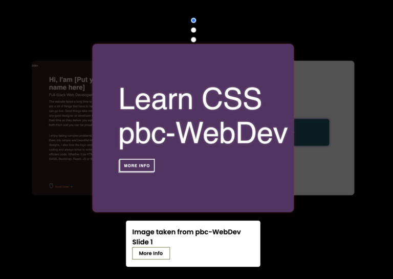
Look at the preview of the Responsive Card Slider project we’ll create in this article. Check it out!
Let’s make a card slider that moves and looks good on different devices. To do this, we’ll use HTML, CSS, and JavaScript. Follow these steps carefully:
Create a Folder:
Make a folder. You can give it any name you like. Inside this folder, create three files.
HTML File:
Make a file called index.html. Remember, the name should be index and end with .html
CSS File:
Make another file called styles.css. Name it styles and make sure it ends with .css
JavaScript File:
Lastly, make a file named index.js. Make sure the name is index and it ends with .js
Get Images:
Click on this Image link to download the images. Put this image folder inside your project folder. All the images you need for your card slider are inside this folder.
Add HTML Code:
Copy the following HTML code and paste them into your index.html file. This code helps to set up your card slider layout. Additionally, the code includes the next and previous icons and the pagination bullet on the bottom for navigation through each slider.
<!DOCTYPE html>
<html lang="en">
<head>
    <meta charset="UTF-8">
    <meta name="viewport" content="width=device-width, initial-scale=1.0">
    <title>Card Slider BY pbc-WebDev</a></title>
    <!--CSS LOCAL-->
    <link rel="stylesheet" href="styles.css">
    <!--CSS SWIPER-->
    <link rel="stylesheet" href="https://cdn.jsdelivr.net/npm/swiper@11.0.6/swiper-bundle.min.css">
</head>
<body>
    <div class="slide-container swiper">
        <div class="slide-content">
            <div class=" card-wrapper swiper-wrapper">
                <!--CARD 1-->
                <div class="card swiper-slide">
                    <div class="image-content">
                        <span class="overlay"></span>
                        <div class="card-image">
                            <img class="card-img" src="./image/boy-1.png" alt="">
                        </div>
                    </div>
                    <div class="card-content">
                        <h2 class="name">Prem Bdr. Chand</h2>
                        <p class="description">Lorem ipsum dolor sit, amet consectetur adipisicing elit. Inventore
                            eaque, minus at in perferendis rerum nobis accusamus eligendi aperiam neque delectus
                            expedita repudiandae eveniet velit. Culpa reprehenderit atque labore tenetur?</p>
                        <button class="button">View Details</button>
                    </div>
                </div>
                <!--CARD 2-->
                <div class="card swiper-slide">
                    <div class="image-content">
                        <span class="overlay"></span>
                        <div class="card-image">
                            <img class="card-img" src="./image/boy-2.png" alt="">
                        </div>
                    </div>
                    <div class="card-content">
                        <h2 class="name">Suman Thapa</h2>
                        <p class="description">Lorem ipsum dolor sit, amet consectetur adipisicing elit. Inventore
                            eaque, minus at in perferendis rerum nobis accusamus eligendi aperiam neque delectus
                            expedita repudiandae eveniet velit. Culpa reprehenderit atque labore tenetur?</p>
                        <button class="button">View Details</button>
                    </div>
                </div>
                <!--CARD 3-->
                <div class="card swiper-slide">
                    <div class="image-content">
                        <span class="overlay"></span>
                        <div class="card-image">
                            <img class="card-img" src="./image/boy-3.png" alt="">
                        </div>
                    </div>
                    <div class="card-content">
                        <h2 class="name">Sagar Khadka</h2>
                        <p class="description">Lorem ipsum dolor sit, amet consectetur adipisicing elit. Inventore
                            eaque, minus at in perferendis rerum nobis accusamus eligendi aperiam neque delectus
                            expedita repudiandae eveniet velit. Culpa reprehenderit atque labore tenetur?</p>
                        <button class="button">View Details</button>
                    </div>
                </div>
                <!--CARD 4-->
                <div class="card swiper-slide">
                    <div class="image-content">
                        <span class="overlay"></span>
                        <div class="card-image">
                            <img class="card-img" src="./image/man-4.png" alt="">
                        </div>
                    </div>
                    <div class="card-content">
                        <h2 class="name">Neeshan Khadka</h2>
                        <p class="description">Lorem ipsum dolor sit, amet consectetur adipisicing elit. Inventore
                            eaque, minus at in perferendis rerum nobis accusamus eligendi aperiam neque delectus
                            expedita repudiandae eveniet velit. Culpa reprehenderit atque labore tenetur?</p>
                        <button class="button">View Details</button>
                    </div>
                </div>
                <!--CARD 5-->
                <div class="card swiper-slide">
                    <div class="image-content">
                        <span class="overlay"></span>
                        <div class="card-image">
                            <img class="card-img" src="./image/man-5.png" alt="">
                        </div>
                    </div>
                    <div class="card-content">
                        <h2 class="name">Kailash Gurung</h2>
                        <p class="description">Lorem ipsum dolor sit, amet consectetur adipisicing elit. Inventore
                            eaque, minus at in perferendis rerum nobis accusamus eligendi aperiam neque delectus
                            expedita repudiandae eveniet velit. Culpa reprehenderit atque labore tenetur?</p>
                        <button class="button">View Details</button>
                    </div>
                </div>
                <!--CARD 6-->
                <div class="card swiper-slide">
                    <div class="image-content">
                        <span class="overlay"></span>
                        <div class="card-image">
                            <img class="card-img" src="./image/man-6.png" alt="">
                        </div>
                    </div>
                    <div class="card-content">
                        <h2 class="name">Rahul Shahi</h2>
                        <p class="description">Lorem ipsum dolor sit, amet consectetur adipisicing elit. Inventore
                            eaque, minus at in perferendis rerum nobis accusamus eligendi aperiam neque delectus
                            expedita repudiandae eveniet velit. Culpa reprehenderit atque labore tenetur?</p>
                        <button class="button">View Details</button>
                    </div>
                </div>
                <!--CARD 7-->
                <div class="card swiper-slide">
                    <div class="image-content">
                        <span class="overlay"></span>
                        <div class="card-image">
                            <img class="card-img" src="./image/woman-1.png" alt="">
                        </div>
                    </div>
                    <div class="card-content">
                        <h2 class="name">Kamana Khadka</h2>
                        <p class="description">Lorem ipsum dolor sit, amet consectetur adipisicing elit. Inventore
                            eaque, minus at in perferendis rerum nobis accusamus eligendi aperiam neque delectus
                            expedita repudiandae eveniet velit. Culpa reprehenderit atque labore tenetur?</p>
                        <button class="button">View Details</button>
                    </div>
                </div>
                <!--CARD 8-->
                <div class="card swiper-slide">
                    <div class="image-content">
                        <span class="overlay"></span>
                        <div class="card-image">
                            <img class="card-img" src="./image/woman-2.png" alt="">
                        </div>
                    </div>
                    <div class="card-content">
                        <h2 class="name">Priti Khadka</h2>
                        <p class="description">Lorem ipsum dolor sit, amet consectetur adipisicing elit. Inventore
                            eaque, minus at in perferendis rerum nobis accusamus eligendi aperiam neque delectus
                            expedita repudiandae eveniet velit. Culpa reprehenderit atque labore tenetur?</p>
                        <button class="button">View Details</button>
                    </div>
                </div>
                <!--CARD 9-->
                <div class="card swiper-slide">
                    <div class="image-content">
                        <span class="overlay"></span>
                        <div class="card-image">
                            <img class="card-img" src="./image/woman-3.png" alt="">
                        </div>
                    </div>
                    <div class="card-content">
                        <h2 class="name">Sujita Shahi</h2>
                        <p class="description">Lorem ipsum dolor sit, amet consectetur adipisicing elit. Inventore
                            eaque, minus at in perferendis rerum nobis accusamus eligendi aperiam neque delectus
                            expedita repudiandae eveniet velit. Culpa reprehenderit atque labore tenetur?</p>
                        <button class="button">View Details</button>
                    </div>
                </div>
            </div>
        </div>
        <div class="swiper-button-next swiper-navBtn"></div>
        <div class="swiper-button-prev swiper-navBtn"></div>
        <div class="swiper-pagination"></div>
    </div>
    <!-- Swiper JS -->
    <script src="https://cdn.jsdelivr.net/npm/swiper@11/swiper-bundle.min.js"></script>
    <!--JAVASCRIPT LOCAL-->
    <script src="index.js"></script>
</body>
</html>
Style with CSS:
Copy the following CSS codes and add them to your styles.css file. This code helps to make your slide look nicer. You can change colors, fonts, and sizes if you want.
* {
  margin: 0;
  padding: 0;
  box-sizing: border-box;
  font-family: sans-serif;
}
body {
  min-height: 100vh;
  display: flex;
  align-items: center;
  justify-content: center;
  background-color: #efefef;
}
.slide-container {
  max-width: 1120px;
  width: 100%;
}
.card {
  border-radius: 25px;
  background-color: #fff;
}
.slide-content {
  margin: 0 40px;
  padding: 45px 20px;
  overflow: hidden;
}
.image-content,
.card-content {
  display: flex;
  flex-direction: column;
  align-items: center;
  padding: 10px 14px;
}
.image-content {
  position: relative;
  row-gap: 5px;
  padding: 25px 0px;
}
.overlay {
  position: absolute;
  left: 0;
  top: 0;
  height: 100%;
  width: 100%;
  background-color: #bebd00;
  border-radius: 25px 25px 0 25px;
}
.overlay::before,
.overlay::after {
  content: "";
  position: absolute;
  right: 0;
  bottom: -40px;
  height: 40px;
  width: 40px;
  background-color: #bebd00;
}
.overlay::after {
  border-radius: 0 25px 0 0;
  background-color: #fff;
}
.card-image {
  position: relative;
  height: 150px;
  width: 150px;
  border-radius: 50%;
  background: #cccccc;
}
.card-image .card-img {
  height: 100%;
  width: 100%;
  object-fit: cover;
  border-radius: 50%;
  border: 4px solid #004754;
}
.name {
  font-size: 18px;
  font-weight: 500;
  color: #004754;
  margin: 0 0 10px 0;
}
.description {
  font-size: 14px;
  color: #004754;
  text-align: center;
}
.button {
  border: none;
  font-size: 14px;
  color: #fff;
  padding: 8px 20px;
  background-color: #004754;
  margin: 14px;
  cursor: pointer;
  transition: all 0.3s ease;
}
.button:hover {
  background-color: #bebd00;
}
.swiper-navBtn {
  transition: color 0.5s ease;
}
.swiper-navBtn::before,
.swiper-navBtn::after {
  font-size: 20px;
}
.swiper-button-next {
  right: 0 !important;
  color: #bebd00 !important;
}
.swiper-button-next:hover {
  color: #004754 !important;
}
.swiper-button-prev {
  left: 0 !important;
  color: #bebd00 !important;
}
.swiper-button-prev:hover {
  color: #004754 !important;
}
.swiper-pagination-bullet {
  background-color: #000000 !important;
  opacity: 1 !important;
}
.swiper-pagination-bullet-active {
  background-color: #bebd00 !important;
}
.swiper-pagination-bullet {
  color: #ffffff !important;
}
@media screen and (max-width: 768px) {
  .slide-content {
    margin: 0 10px;
  }
  .swiper-navBtn {
    display: none !important;
  }
}
JavaScript:
Finally, add the following javascript code to your index.js file. This code makes your cards moveable when you click the icons or pagination bullet dots.
var swiper = new Swiper(".slide-content", {
  slidesPerView: 3,
  spaceBetween: 25,
  loop: true,
  centerSlide: true,
  fade:true,
  grabCursor: true,
  pagination: {
    el: ".swiper-pagination",
    clickable: true,
    dynamicBullets: true,
  },
  navigation: {
    nextEl: ".swiper-button-next",
    prevE1: ".swiper-button-prev",
  },
  breakpoints: {
    0 : {
      slidesPerView: 1,
    },
    520 : {
      slidesPerView: 2,
    },
    990 : {
      slidesPerView: 3,
    }
  },
});
Conclusion:
After doing these steps, you should see three cards sliding on your webpage. This means your slider is working! By doing it from the start, you’ll understand how sliders work and can change them for your needs.
Now that you made a responsive card slider, try making other cool things! Use what you have learned to create more exciting projects and become even better at web development.
If your card slider doesn’t work or you’re stuck, you can get the source code for free. Just click the “Download Source Code” button to get the source code files.