Create a Simple Responsive Table Of Contents (TOC) Template For An Article Using HTML, CSS, and JavaScript
On the internet, sharing information in blog articles is very important. We can help users easily find what they want to read by using a Table of Contents (TOC). It’s similar to the map in a book, showing users where to go. Today, we’ll learn how to create a TOC for a blog using HTML, CSS, and JavaScript. TOC helps us know where to go on a page. Understanding some code helps us create interesting things like this. When we know how to make a TOC, we can make our articles easier to navigate.
Now, let’s get into it. Here’s a bit of HTML Template, which is like the map and we’ll use it to build our TOC. You can use it as a template for all of your blog articles or you can modify it as you want.
HTML Code For Table Of Content
Below is the HTML Template for Table Of Content (TOC)
<!DOCTYPE html>
<html lang="en">
<head>
    <meta charset="UTF-8">
    <meta name="viewport" content="width=device-width, initial-scale=1.0">
    <link rel="stylesheet" href="styles.css">
    <title>Responsive Table of Contents Template | pbc-webdev</title>
    <style>
        <!-- CSS Styles -->
    </style>
</head>

<body>
    <div class="container">
        <h1 class="title">Title of the Article</h1>

        <!-- Table of Contents -->
        <div class="toc" id="toc">
            <ul>
                <li><a href="#section1">Section 1</a></li>
                <li><a href="#section2">Section 2</a></li>
                <li><a href="#section3">Section 3</a></li>
                <li><a href="#section4">Section 4</a></li>
                <li><a href="#section5">Section 5</a></li>
            </ul>
        </div>

        <!-- Content Sections -->
        <div class="content">
            <!-- Section 1 -->
            <h2 id="section1">Section 1</h2>
            <p>This is the content of section 1.</p>
            <!-- Section 2 -->
            <h2 id="section2">Section 2</h2>
            <p>This is the content of section 2.</p>
            <!-- Section 3 -->
            <h2 id="section3">Section 3</h2>
            <p>This is the content of section 3.</p>
            <!-- Section 4 -->
            <h2 id="section4">Section 4</h2>
            <p>This is the content of section 4.</p>
            <!-- Section 5 -->
            <h2 id="section5">Section 5</h2>
            <p>This is the content of section 5.</p>
        </div>
        <!-- Scroll to Top Button -->
        <button class="scroll-to-top" onclick="scrollToTop()">↑</button>
    </div>

    <!-- JavaScript -->
    <script>
        // JavaScript Functions
    </script>
</body>
</html>
But what makes this HTML document special? Let’s uncover its secrets:
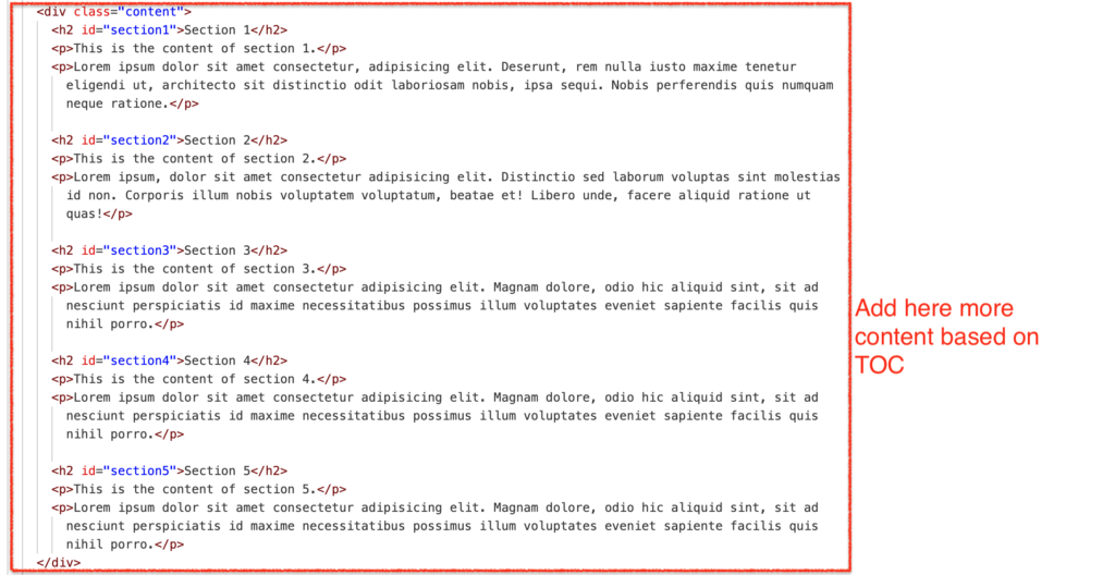
Firstly, notice how we’ve structured our TOC with `<div class=”toc”>` and `<ul>` elements. Each `<li>` within contains are clickable link (`<a>`) that leads to a specific section of the article. This provides a quick and easy way for readers to navigate.
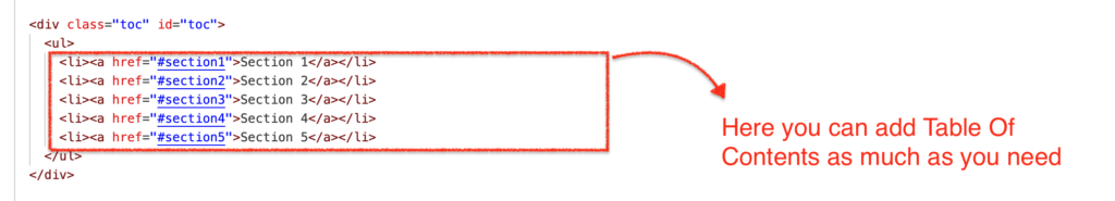
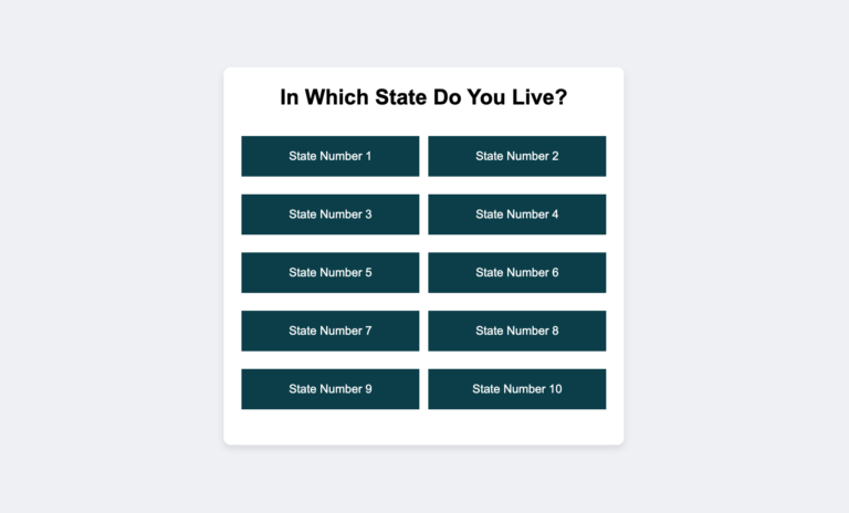
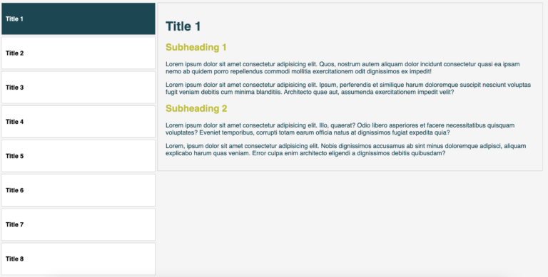
Feel free to add TOC as much as you need. If you add more TOC do not forget to link them into the content section. See the picture below.
To ensure our TOC is always within reach, we’ve added the power of CSS with `position: sticky`. This keeps it firmly anchored to the top of the page, even as we scroll. A touch of styling makes it visually appealing and easy to navigate
But there’s more! When you click on the specific TOC title it will scroll very smoothly. Because we have added this feature using JavaScript. With just a click, readers are navigated away to their desired section.
And if you scroll down there a button appears at the bottom right corner. When the reader or user clicks on it, it will scroll up to the top with smooth effect.
Indeed this HTML document serves as a sample template, ready to accept the pages of countless blog articles. With its responsive design and smooth navigation, it ensures a seamless reading experience for all who want to read the article. So, embrace the beauty of code, and let your audience be guided by the gentle touch of a responsive TOC.
CSS Code for Table Of Content
Below is the CSS code for Table Of Content (TOC)
body {
  font-family: Arial, sans-serif;
  margin: 0;
  padding: 0;
  background-color: #f9f9f9;
  color: #333;
}
.container {
  max-width: 800px;
  margin: 0 auto;
  padding: 20px;
  background-color: #fff;
  border-radius: 8px;
  box-shadow: 0 0 20px rgba(0, 0, 0, 0.1);
  margin-top: 50px;
  margin-bottom: 50px;
  overflow-x: hidden;
  /* This line Prevent horizontal scrolling */
  position: relative;
}
.title {
  text-align: center;
  margin-top: 20px;
  margin-bottom: 30px;
  color: #004754;
  font-size: 35px;
}
.toc {
  position: sticky;
  top: 20px;
  left: 20px;
  right: 20px;
  width: 100%;
  background-color: #f0f0f0;
  padding: 10px;
  box-shadow: 0 2px 5px rgba(0, 0, 0, 0.1);
  z-index: 1000;
  border-radius: 8px;
}
.toc ul {
  list-style-type: none;
  padding: 0;
  margin: 0;
}
.toc ul li {
  margin-left: 10px;
  margin-bottom: 5px;
  font-size: 18px;
  line-height: 25px;
}
.content {
  padding: 20px;
}
h2 {
  margin-top: 20px;
  margin-bottom: 10px;
  color: #004754;
  font-size: 20px;
  border-bottom: 1px solid #ddd;
  padding-bottom: 10px;
}
/* Style for active section heading when user clicks the Table of Content*/
.active-section {
  background-color: #004754;
  color: white;
  padding: 10px;
}
p {
  color: #666;
  line-height: 1.6;
}
a {
  color: #007bff;
  text-decoration: none;
}
a:hover {
  text-decoration: underline;
}
/*Media Query for Responsive adjustments */
@media only screen and (max-width: 600px) {
  .container {
    max-width: 100%;
    border-radius: 0;
    box-shadow: none;
  }
  .toc {
    position: static;
    width: 100%;
    margin-bottom: 20px;
    margin-right: 20px;
  }
}
/* Code for Scroll up button */
.scroll-to-top {
  position: fixed;
  bottom: 20px;
  right: 20px;
  background-color: #bebd00;
  color: #fff;
  border: none;
  border-radius: 50%;
  width: 40px;
  height: 40px;
  line-height: 40px;
  text-align: center;
  font-size: 24px;
  cursor: pointer;
  display: none;
  /* Initially hidden */
  z-index: 1001;
  /* Above other content */
}
If you want to find out about every single line of the above css code then here is the explanation. Let’s break down the CSS code step by step:
Body Styles
body {
      font-family: Arial, sans-serif;
      margin: 0;
      padding: 0;
      background-color: #f9f9f9;
      color: #333;
}- `font-family`: It sets the font family to Arial or a generic sans-serif font.
- `margin` and `padding`: It sets the margin and padding to 0 to remove any default spacing around the body.
- `background-color`: Sets the background color to a light gray (#f9f9f9) for all over the page.
- `color`: Sets the text color to a dark gray (#333). The default value will be dark gray.
Container Styles
.container {
      max-width: 800px;
      margin: 0 auto;
      padding: 20px;
      background-color: #fff;
      border-radius: 8px;
      box-shadow: 0 0 20px rgba(0, 0, 0, 0.1);
      margin-top: 50px;
      margin-bottom: 50px;
      overflow-x: hidden;
      /* This line Prevent horizontal scrolling */
      position: relative;
}- `.container`: Styles a container element with the following properties:
- `max-width`: Sets the maximum width to 800 pixels.
- `margin`: Centers the container horizontally by setting top and bottom margins to 0 and left and right margins to “auto”.
- `padding`: Adds 20 pixels of padding inside the container.
- `background-color`: Sets the background color to white (#fff).
- `border-radius`: Adds a border radius of 8 pixels to give rounded corners.
- `box-shadow`: Adds a subtle shadow effect to the container.
- `margin-top` and `margin-bottom`: Adds 50 pixels of margin at the top and bottom of the container.
- `overflow-x`: Prevents horizontal scrolling.
- `position`: Sets the position to relative, which is used for positioning child elements.
Title Styles
.title {
     text-align: center;
     margin-top: 20px;
     margin-bottom: 30px;
     color: #004754;
     font-size: 35px;
}- `.title`: Styles the title of the article with the following properties:
- `text-align`: Centers the text.
- `margin-top` and `margin-bottom`: Adds spacing above and below the title.
- `color`: Sets the text color to a dark teal (#004754).
- `font-size`: Sets the font size to 35 pixels.
Table of Contents Styles
.toc {
     position: sticky;
     top: 20px;
     left: 20px;
     right: 20px;
     width: 100%;
     background-color: #f0f0f0;
     padding: 10px;
     box-shadow: 0 2px 5px rgba(0, 0, 0, 0.1);
     z-index: 1000;
     border-radius: 8px;
}- `.toc`: Styles the table of contents with the following properties:
- `position`: Sets the position to sticky, making it stick to the top of the viewport when scrolled.
- `top`, `left`, and `right`: Positions the TOC 20 pixels from the top, left, and right edges of its containing block.
- `width`: Sets the width to 100%.
- `background-color`: Sets the background color to a light gray (#f0f0f0).
- `padding`: Adds 10 pixels of padding inside the TOC.
- `box-shadow`: Adds a shadow effect.
- `z-index`: Sets the stacking order of the TOC.
- `border-radius`: Adds rounded corners to the TOC.
List Styles
.toc ul {
     list-style-type: none;
     padding: 0;
     margin: 0;
   }


   .toc ul li {
     margin-left: 10px;
     margin-bottom: 5px;
     font-size: 18px;
     line-height: 25px;
   }
- `.toc ul` and `.toc ul li`: Styles the unordered list inside the TOC, removing default list styles and adding custom margins, font size, and line height.
Content Styles
.content {
     padding: 20px;
}- `.content`: Adds 20 pixels of padding inside the content area.
Heading Styles
h2 {
     margin-top: 20px;
     margin-bottom: 10px;
     color: #004754;
     font-size: 20px;
     border-bottom: 1px solid #ddd;
     padding-bottom: 10px;
}- `h2`: Styles level 2 headings with properties such as margin, color, font size, and a bottom border for a separation effect.
Active Section Styles
/* Style for active section heading when user clicks the Table of Content*/
   .active-section {
     background-color: #004754;
     color: white;
     padding: 10px;
}- `.active-section`: Styles the active section heading in the TOC with a different background color and white text color to indicate the currently active section.
Link Styles
a {
     color: #007bff;
     text-decoration: none;
   }


   a:hover {
     text-decoration: underline;
}- `a` and `a:hover`: It links with a specific color and it removes the default underline.
- On hover, it adds an underline effect.
Media Query
 /*Media Query for Responsive adjustments */
   @media only screen and (max-width: 600px) {
     .container {
       max-width: 100%;
       border-radius: 0;
       box-shadow: none;
     }
     .toc {
       position: static;
       width: 100%;
       margin-bottom: 20px;
       margin-right: 20px;
     }
}- It adjusts styles for screens with a maximum width of 600 pixels, making the container full width, removing border radius and box-shadow, and changing the TOC position to static.
Scroll-to-Top Button Styles
/* Code for Scroll up button */
   .scroll-to-top {
     position: fixed;
     bottom: 20px;
     right: 20px;
     background-color: #bebd00;
     color: #fff;
     border: none;
     border-radius: 50%;
     width: 40px;
     height: 40px;
     line-height: 40px;
     text-align: center;
     font-size: 24px;
     cursor: pointer;
     display: none;
     /* Initially hidden */
     z-index: 1001;
     /* Above other content */
}- `.scroll-to-top`: It styles a fixed-position button that appears at the bottom right of the viewport with a yellow background, white text, and a round shape. It’s initially hidden and it becomes visible when the user scrolls down.
JavaScript Code for Table Of Content
Below is the JavaScript code for Table Of Content (TOC). Once the user clicks the TOC elements it will smoothly navigate the user.
// Smooth scroll to section and highlight active section heading

document.querySelectorAll(".toc a").forEach((anchor) => {
  anchor.addEventListener("click", function (e) {
    e.preventDefault();

    const targetId = this.getAttribute("href").substring(1);
    const targetSection = document.getElementById(targetId);

    // Scroll to target section
    window.scrollTo({
      top: targetSection.offsetTop,
      behavior: "smooth",
    });

    // Remove active class from all h2 elements
    document.querySelectorAll("h2").forEach((heading) => {
      heading.classList.remove("active-section");
    });

    // Add active class to target section heading
    targetSection.classList.add("active-section");
  });
});

// Show scroll-to-top button when scrolling down
window.onscroll = function () {
  if (
    document.body.scrollTop > 300 ||
    document.documentElement.scrollTop > 300
  ) {
    document.querySelector(".scroll-to-top").style.display = "block";
  } else {
    document.querySelector(".scroll-to-top").style.display = "none";
  }
};

// Scroll to top function
function scrollToTop() {
  window.scrollTo({
    top: 0,
    behavior: "smooth",
  });
}
This JavaScript code provides three main functionalities:
It Provides a Smooth Scroll to Section and Highlights the Active Section Heading
// Smooth scroll to section and highlight active section heading
document.querySelectorAll(".toc a").forEach((anchor) => {
  anchor.addEventListener("click", function (e) {
    e.preventDefault();

    const targetId = this.getAttribute("href").substring(1);
    const targetSection = document.getElementById(targetId);

    // Scroll to target section
    window.scrollTo({
      top: targetSection.offsetTop,
      behavior: "smooth",
    });

    // Remove active class from all h2 elements
    document.querySelectorAll("h2").forEach((heading) => {
      heading.classList.remove("active-section");
    });

    // Add active class to target section heading
    targetSection.classList.add("active-section");
  });
});- It selects all `<a>` elements within the table of contents (`.toc`) and adds a click event listener to each.
- When a TOC link is clicked, it prevents the default behavior (navigating to a new page) using `e.preventDefault()`.
- It retrieves the target section’s ID from the clicked link’s `href` attribute and removes the leading `#` using `substring(1)`.
- Then, it finds the corresponding section element using `document.getElementById(targetId)`.
- It smoothly scrolls to the target section using `window.scrollTo()` with the `behavior` option set to `’smooth’`.
- Next, it removes the `active-section` class from all `<h2>` elements to clear any previous active sections.
- Finally, it adds the `active-section` class to the target section’s heading to highlight it in the TOC.
It Shows Scroll-to-Top Button When Scrolling Down
// Show scroll-to-top button when scrolling down
window.onscroll = function () {
  if (
    document.body.scrollTop > 300 ||
    document.documentElement.scrollTop > 300
  ) {
    document.querySelector(".scroll-to-top").style.display = "block";
  } else {
    document.querySelector(".scroll-to-top").style.display = "none";
  }
};- It sets up a scroll event listener (`window.onscroll`) to detect when the user scrolls the page.
- When the scroll position (either `document.body.scrollTop` or `document.documentElement.scrollTop`) is greater than 300 pixels, it displays the scroll-to-top button by setting its `display` style property to `’block’`.
- If the scroll position is less than or equal to 300 pixels, it hides the scroll-to-top button by setting its `display` style property to `’none’`.
Scroll to Top Function
// Scroll to top function
function scrollToTop() {
  window.scrollTo({
    top: 0,
    behavior: "smooth",
  });
}- It defines a function named `scrollToTop()` that scrolls the window to the top of the page.
- Inside the function, it uses `window.scrollTo()` with the `top` option set to `0` to scroll to the top.
- The `behavior` option is set to `’smooth’` to achieve a smooth scrolling effect.
Together, these functionalities control the user experience by providing smooth scrolling between sections, highlighting the active section in the TOC, showing a scroll-to-top button when the user scrolls down, and enabling the user to easily scroll back to the top of the page.
Do you want to try to do it yourself? Please download the source code by clicking the following button.