Creating a Beautiful Manual Slider with HTML and CSS
In the world of web development, sliders are a common and attractive way to showcase content, whether it’s images, products, or any other information. If you’re looking to create an elegant and user-friendly slider for your website, or you want to pracitce your web development skills, you’re in the right place. In this article, I will walk you through the process of building a manual slider using only HTML and CSS.
Why a Manual Slider?
Manual sliders provide users with more control over the content they’re viewing, allowing them to navigate at their own pace. In this tutorial, we’ll be creating a slider that can be navigated using radio buttons or by clicking on the left and right blurred images, ensuring an engaging and interactive user experience.
The HTML Structure
Let’s start by setting up the HTML structure for our manual slider. Create a folder in your computer and give a suitable name. Inside the folder create two files as following:
- ‘
slider.html'for HTML code. - ‘
slider.css'for CSS code.
Here’s an example of what your HTML might look like:
<!DOCTYPE html>
<html>
<head>
<title>Responsive Slider using HTML and CSS</title>
<meta name="viewport" content="width=device-width, initial-scale=1.0">
<link rel="stylesheet" href="slider.css">
</head>
<body>
<div class="container">
<input type="radio" name="slider" id="item-1" checked>
<input type="radio" name="slider" id="item-2">
<input type="radio" name="slider" id="item-3">
<div class="cards">
<label class="card" for="item-1" id="card-1">
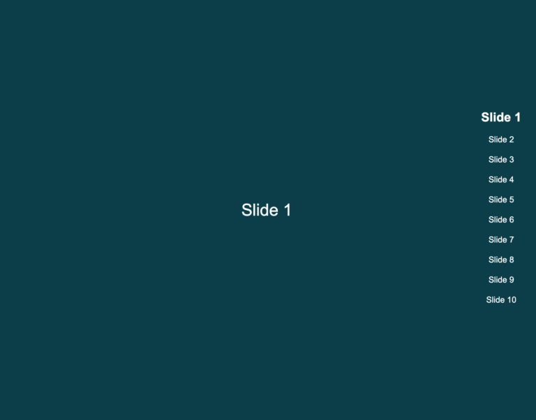
<img decoding="async" src="https://pbc-webdev.com/wp-content/uploads/2023/11/CoverImageForVideo-pbc-webdev.png" alt="Image1">
</label>
<label class="card" for="item-2" id="card-2">
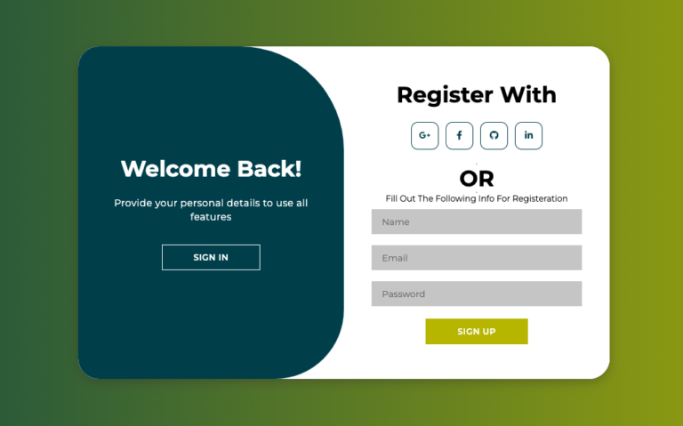
<img decoding="async" src="https://pbc-webdev.com/wp-content/uploads/2023/10/LogInAndRegisterButton.png" alt="Image2">
</label>
<label class="card" for="item-3" id="card-3">
<img decoding="async" src="https://pbc-webdev.com/wp-content/uploads/2023/10/Responsive-Navigation.png" alt="Image3">
</label>
</div>
<div class="imageInfoContainer">
<div class="innerContainer">
<div class="info-area" id="imageInfoArea">
<label class="image-info" id="image-info-1">
<div class="title">Image taken from pbc-WebDev</div>
<div class="subtitle">Slide 1</div>
<div class="button"> <a href="https://pbc-webdev.com/awesome-slideshows/">More Info</a></div>
</label>
<label class="image-info" id="image-info-2">
<div class="title">Image taken from pbc-WebDev</div>
<div class="subtitle">Slide 2</div>
<div class="button"> <a href="https://pbc-webdev.com/learn-to-make-beautiful-login-registration-form-using-html-css-and-javascript/">More Info</a></div>
</label>
<label class="image-info" id="image-info-3">
<div class="title">Image taken from pbc-WebDev</div>
<div class="subtitle">Slide 3</div>
<div class="button"> <a href="https://pbc-webdev.com/make-a-responsive-navigation-with-html-css-and-javascript-for-your-portfolio-website/">More Info</a></div>
</label>
</div>
</div>
</div>
</div>
<script src="slider.js"></script>
</body>
</html>The CSS Styles
Now, let’s add some CSS to style our slider. In your slider.css file, you can use the following CSS code:
@import url('https://fonts.googleapis.com/css2?family=Poppins:wght@200;300;400;500;600;700;800;900&display=swap');
* {
  box-sizing: border-box;
}
html, body {
  margin: 0;
  padding: 0;
  width: 100%;
  height: 100%;
}
body {
  display: -webkit-box;
  display: flex;
  -webkit-box-align: center;
          align-items: center;
  -webkit-box-pack: center;
          justify-content: center;
  padding: 30px 10px;
  font-family: 'Poppins', sans-serif;
  background-color: #000;
}
input[type=radio] {
  height: 30px;
}
.card {
  position: absolute;
  width: 60%;
  height: 100%;
  left: 0;
  right: 0;
  margin: auto;
  -webkit-transition: -webkit-transform .4s ease;
  transition: -webkit-transform .4s ease;
  transition: transform .4s ease;
  transition: transform .4s ease, -webkit-transform .4s ease;
  cursor: pointer;
}
.container {
  width: 100%;
  max-width: 800px;
  max-height: 600px;
  height: 100%;
  -webkit-transform-style: preserve-3d;
          transform-style: preserve-3d;
  display: -webkit-box;
  display: flex;
  -webkit-box-pack: center;
          justify-content: center;
  -webkit-box-orient: vertical;
  -webkit-box-direction: normal;
          flex-direction: column;
  -webkit-box-align: center;
          align-items: center;
}

.cards {
  position: relative;
  width: 100%;
  height: 100%;
  margin-bottom: 20px;
}
img {
  width: 100%;
  height: 100%;
  border-radius: 10px;
  -o-object-fit: cover;
     object-fit: cover;
}
#item-1:checked ~ .cards #card-3, #item-2:checked ~ .cards #card-1, #item-3:checked ~ .cards #card-2 {
  -webkit-transform: translatex(-40%) scale(0.8);
          transform: translatex(-40%) scale(0.8);
  opacity: .4;
  z-index: 0;
}
#item-1:checked ~ .cards #card-2, #item-2:checked ~ .cards #card-3, #item-3:checked ~ .cards #card-1 {
  -webkit-transform: translatex(40%) scale(0.8);
          transform: translatex(40%) scale(0.8);
  opacity: .4;
  z-index: 0;
}
#item-1:checked ~ .cards #card-1, #item-2:checked ~ .cards #card-2, #item-3:checked ~ .cards #card-3 {
  -webkit-transform: translatex(0) scale(1);
          transform: translatex(0) scale(1);
  opacity: 1;
  z-index: 1;
}
#item-1:checked ~ .cards #card-1 img, #item-2:checked ~ .cards #card-2 img, #item-3:checked ~ .cards #card-3 img {
  box-shadow: 0px 0px 5px 0px rgba(203, 32, 32, 0.47);
}
.imageInfoContainer {
  background-color: #fff;
  border-radius: 5px;
  min-width: 320px;
  padding: 15px 15px;
  font-weight: 600;
  height: 150px;
}

.innerContainer {
  position: relative;
  display: -webkit-box;
  display: flex;
  -webkit-box-align: center;
          align-items: center;
  margin-bottom: 12px;
  height: 100%;
  overflow: hidden;
}
.card-info .title {
  color: #403d40;
  font-size: 14px;
  line-height: 24px;
}
.info-area {
  width: 100%;
  position: absolute;
  top: 0;
  left: 0px;
  -webkit-transition: -webkit-transform .4s ease-in;
  transition: -webkit-transform .4s ease-in;
  transition: transform .4s ease-in;
  transition: transform .4s ease-in, -webkit-transform .4s ease-in;
}
.info-area .button {
    background-color: transparent;
    border: 1px solid darkolivegreen;
    width: 90px;
    padding: 5px 15px;
    font-size: 12px;
    cursor: pointer;
}
.info-area .button:hover {
    background-color: gray;
}
.info-area .button a {
    text-decoration: none;
    color: #000;
}
.info-area .button a:hover {
    color: white;
}
#item-2:checked ~ .imageInfoContainer #imageInfoArea {
  -webkit-transform: translateY(0px);
          transform: translateY(0px);
}
#item-2:checked ~ .imageInfoContainer #imageInfoArea {
  -webkit-transform: translateY(-78px);
          transform: translateY(-78px);
}
#item-3:checked ~ .imageInfoContainer #imageInfoArea {
  -webkit-transform: translateY(-155px);
          transform: translateY(-155px);
}
@media (max-width: 767px){
    .container{
        height:300px;
    }
}
Now, open the html file in your desired web browser and you should work perfectly. With HTML and CSS structure, you have set up the basic foundation for your manual slider. You can now customize the HTML elements with your desired content and further customize the CSS styles to match your website’s designs.
Adding JavaScript (Optional)
While we’ve created a manual slider using only HTML and CSS, you can enhance its functionality by adding some JavaScript. JavaScript can be used to control the slider’s behavior and provide additional features, such as automatic sliding or touch support for mobile devices. If you need help to add JavaScript code. Please feel free to write us.
Conclusion
Creating a manual slider using HTML and CSS is a great way to add a visually appealing element to your website. Users will enjoy the interactive experience of navigating through content at their own pace. By following this tutorial and customizing it to your specific needs, you can create a beautiful and functional manual slider that enhances your website’s design and user engagement.